


May 10, 2016
Critics React to Snøhetta’s SFMOMA Extension
The museum’s much-talked-about new wing opens on May 14th. Here’s what the critics are saying about it.
All photography courtesy Henrik Kam
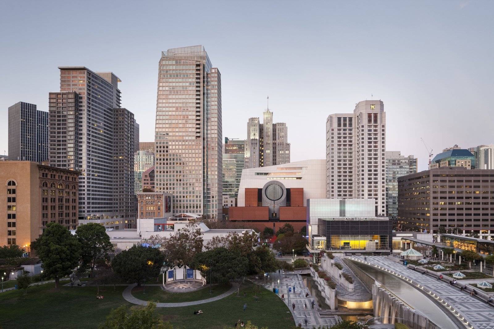
Shoehorned into the narrow space behind Mario Botta’s 1995 museum building, SFMOMA’s new wing was forced to go where few museums have gone before: up. Rising 10 stories into the San Francisco skyline, the Snøhetta-design building nearly triples the amount of existing gallery space and adds a new entrance into what is now one of the world’s largest museums dedicated to modern art. As SFMOMA is preparing to reopen to the public May 14th, the critics’ takes are rolling in. Did the restrictive site inspire a unique design solution or limit the creative possibilities of the project?
“The pair do not make a particularly happy marriage. Indeed, after visiting the conjoined complex, it makes you wonder why one was deferentially kept at the expense of the other, while being considerably lobotomized in the process.” —Oliver Wainwright, The Guardian
The first box on most critics’ checklists was to compare and contrast the new and old sections of the building. Wainwright was especially critical of Snøhetta’s decision to remove the existing monumental staircase located under the oculus of the Botta building while replacing it with “an open wooden stair, angled off-centre and rising in a jaunty dog-leg…like erecting an Ikea flat-pack in a temple.”
But the extension’s treatment of its predecessor is not Wainwright’s only objection to the new structure; he also found the innovative panels cladding the building’s exterior to be tacky, and the interior details continuing the “Ikea flatpack sensibility”:
“Clad in undulating panels of white fibre-reinforced polymer, which are intended to recall both fog and the rippling water in the bay, the building has an inescapable flimsiness, as if it has been carved from polystyrene like the architectural models on display inside… Compared to the carefully detailed brickwork and banded granite blocks of the Botta building next door, the whole thing feels a bit cheap, in both material quality and architectural thinking.”

“Should the museum simply have knocked down the older building and started from scratch on a prominent and roomy site? My trip to San Francisco has left me thinking it probably should have.” —Christopher Hawthorne, LA Times
Hawthorne also took issue with the way the new and old buildings interact, again citing the destruction of the monumental staircase. But rather than blame the expansion for this error and others, he targets the original Botta building as the culprit, suggesting the museum would have been best served by giving Snøhetta a tabula rasa:
“SFMOMA has killed its 1995 building to save it, or saved it to kill it. Take your pick. It’s a strategy that might make sense if the Botta were layered or complex enough as a work of architecture to survive this kind of dismantling. But it’s not.”
As its own building, Hawthorne admires Snøhetta’s architectural moves, describing them as “deft,” though he worries that by tucking itself into an alleyway and obstructing views of its own facade by its bulging in key locations, the building is a little too apologetic in its deference to the existing building and neighboring centers of commerce:
“The really striking quality of that moment of aggression toward the Botta building is that is seems altogether out of character with the rest of the addition. In almost every other way the Snøhetta design is handsome, carefully intelligent, self-effacing and agreeable.”
In the end, Hawthorne laments that Snøhetta was given so little room and so many restrictions to work with, suggesting that downtown San Francisco is in need of a contemporary building with some personality:
“What San Francisco needs at the moment is a full-on and unapologetic expression of contemporary architecture and culture, granted both the space and the institutional permission to make its own statement, to be surprising, challenging, occasionally irrational and maybe even downright weird.”

“Welcome to the new museum experience—casual, transparent and diverting.” —Julie Iovine, Wall Street Journal
Iovine sees the SFMOMA expansion as a reflection of the current trend of openness and interaction in museum design; the building is meant for the public as much as the art. She also sees the connection between old and new not as fratricide, but as creating a “one-two punch” for the city’s skyline:
“There was considerable hoopla over the removal of Botta’s monumentally boxy stairway that stacked up to a mesmerizing circular skylight. But, in fact, it was always too narrow for everyday public use. Its replacement is a less intrusive, more generous staircase that inscribes a square as it rises in deference to Botta’s love of primary forms.”
Iovine also notes the addition’s tendency to hide itself from view, but suggests that it allows the building to feel “not vast and intimidating, but inviting and easy to navigate.”
“With attendance numbers expected to exceed 1.2 million a year, circulation—the art of moving people around—takes on real significance. Snøhetta handles this problem artfully, endowing unexpected moments with an appealing sense of craftsmanship and materiality.”
Most important to Iovine is that the museum is able to get as many people through the galleries as possible while maintaining a unique architectural experience, and in that regard, she deems it a rousing success:
“Snøhetta’s expansion has imagined new ways to experience art in a world filled with museum-goers on the move.”

“Snøhetta’s addition is pure San Francisco, quirks and all.” —Josephine Minutillo, Architectural Record
Minutillo notes the lack of true precedent for a museum as tall as the SFMOMA extension’s 200 feet, and admires the new building’s willingness to have its own identity while still respecting Botta’s original:
“Rather than adjoining a quiet box, as minimalist David Chipperfield did at Cass Gilbert’s classical St. Louis Art Museum, Snøhetta designed an addition that asserts itself as a work of architecture in its own right, while showing the appropriate amount of deference to Botta’s aggressive pile.”
Minutillo also lauds the innovative facade system, but worries that in a fast-developing downtown district, its most interesting face may soon be completely obscured by its surroundings:
“The greatest achievement of the project is the way it is rooted within place, with its grand white facade of silicate crystals from Monterey Bay embedded in its panels’ surfaces catching the city’s dramatically changing light. It is one more voice in the cacophony of singular buildings, its own predecessor not the least of these.”
A version of this article originally appeared on ArchDaily.
Recent Viewpoints


Viewpoints
Navigating the Path to Net Zero
