


December 1, 2015
Arne Jacobsen’s Series 7 Chair Gets Splash of Color
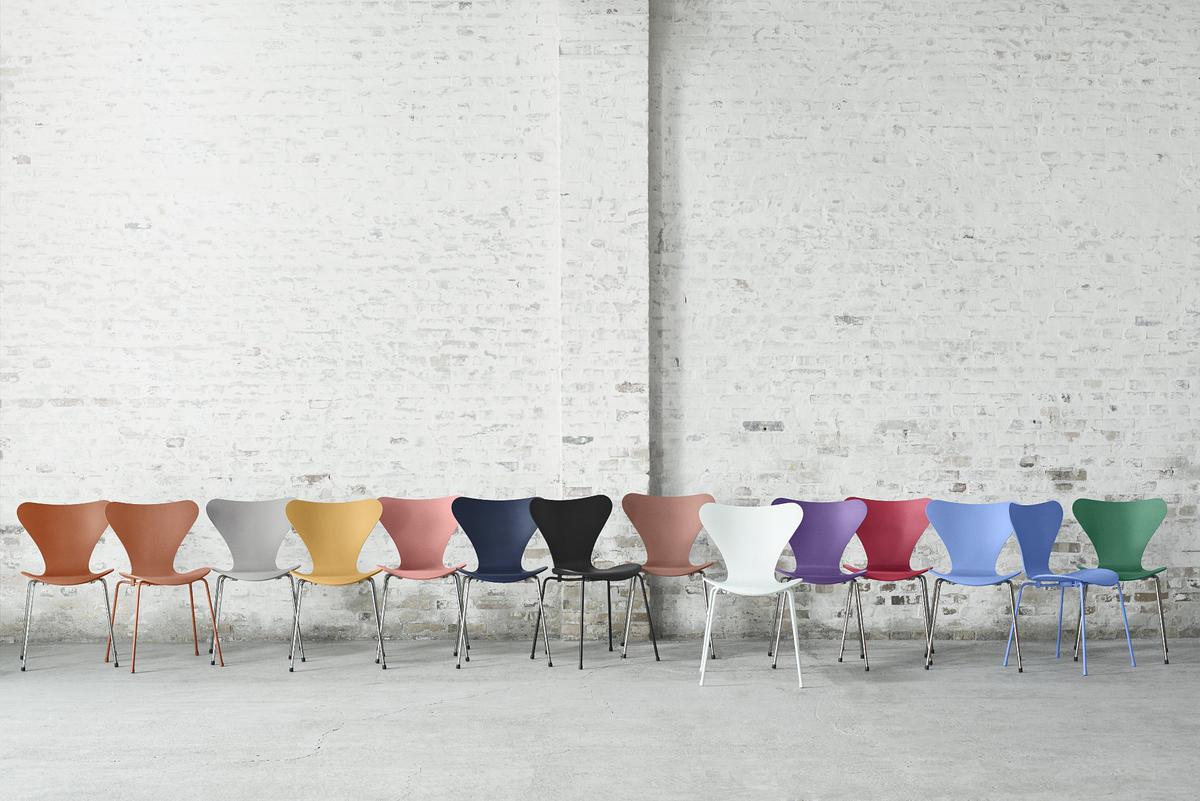
One of Arne Jacobsen’s most popular creations, the Series 7 chair from Fritz Hansen, gets a splash of color to mark its 60th anniversary.
To honor the 60th anniversary of Arne Jacobsen’s Series 7 chair, Fritz Hansen solicited the artistic talents of Tal R, who devised more than a dozen new colors for the design.
Courtesy Fritz Hansen/Ditte Isager
The Helsingborg Exhibition 1955 was the last World’s Fair to be held in Sweden, but it’s particularly memorable for another reason. It was there that one of the most iconic chairs in history debuted: Arne Jacobsen’s Series 7 chair for Fritz Hansen.
Long before designers paid serious heed to ergonomics and anatomy, Jacobsen took the curves of the human body into account. The gentle give in the Series 7’s plywood back accommodated different postures, while the waterfall seat edge provided unobtrusive support to the thighs.
“Jacobsen took two resilient materials—laminated wood and steel tubing—and put them together in such a way that preserves that resilience, so that the seat and base flex slightly as we shift position in the chair,” says Michael Sheridan, author of Room 606: The SAS House and the Work of Arne Jacobsen (Phaidon, 2011). “The connection between base and shell is rigid, but he used rubber bumpers to support the shell above the steel legs. These bumpers allow the shell to move slightly, responding as we shift our weight in the chair.”
Even though the chair has been blatantly copied, it’s hard to match the original. A 2012 video by Fritz Hansen exposed the vast difference in quality between the original and knockoffs by having a man unceremoniously jump on the bend of the plywood back of a true Series 7 and two copies. Both copies broke easily, while the real version held fast.
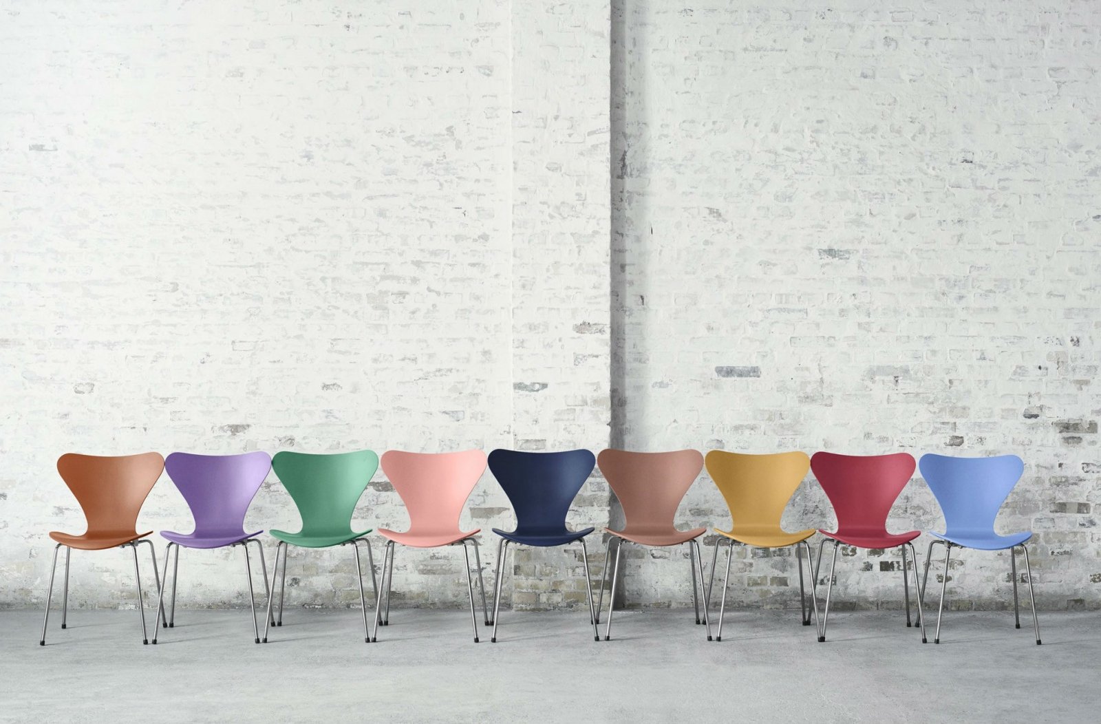
In celebration of the Series 7’s 60th anniversary, Fritz Hansen sought the talents of Danish artist Tal R—known for his sharp eye for chromatics—to pick nine new colors for the chair. While creating the various hues, Tal R approached the task from a purely artistic perspective. “Art is the only field where mistakes, misunderstandings, and contradictions can be productive. So I wanted to introduce that into the colors and chairs—narratives,” the artist says. “When I came to red, for example, I wanted to think about Shanghai, and my imagination and misunderstanding of it. I wanted to find the color that resonated with that memory and that narrative. Colors need to be about necessity and obsession.” The ensuing spectrum injects a revitalized spirit into the classic, making it relevant to new audiences.
Among the colors pictured below are nine chosen by Tal R:
-
Chevalier is an aristocratic orange
-
Egyptian Yellow harks to the past
-
Alstadt Rose is a Tal R signature color
-
AI translates to indigo blue in Japanese
-
Chocolate Milk Brown is a note of indulgence
-
Evren Purple is named for the artist’s wife
-
Opium Red evokes 1930s Shanghai
-
Trieste is the blue loved by the Impressionists
-
Hüzün Green comes from the streets of Istanbul


