


December 31, 2014
Metropolis, Reimagined and Redesigned
“In the magazine we can collect a universe of ideas.”

Photography by Mike Garten
Why did we choose to redesign Metropolis for our special product issue? For the obvious reason that an object needs to be experienced to be understood, used, and enjoyed. With that in mind, we invite you to examine the object you’re holding in your hands, leaf through its pages for your first look, notice the paper, the typeface, the wayfinding system, and the treatment of images, all in the service of our new ways of covering design and architecture at all scales (our mission from the very beginning). Then, take in the content more closely. As you get involved, here’s what you’ll find:
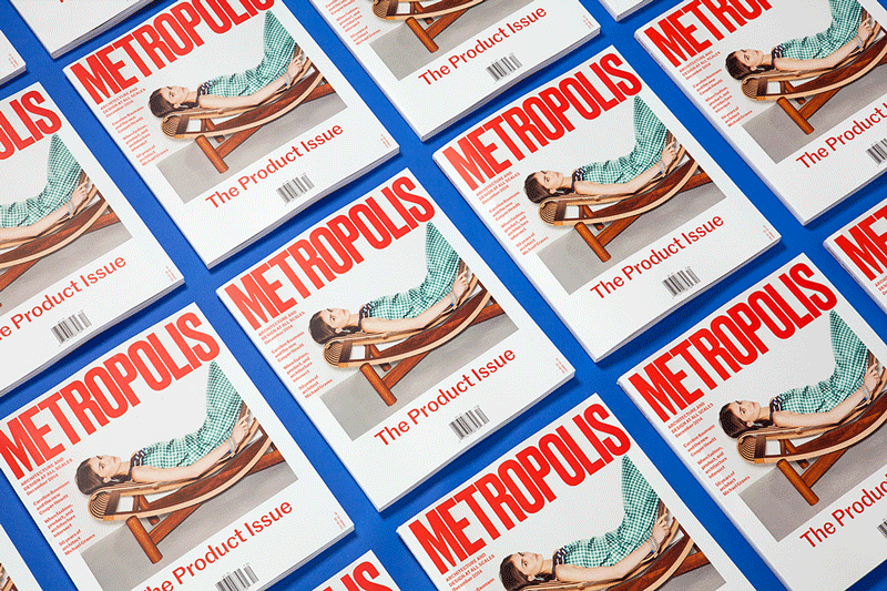
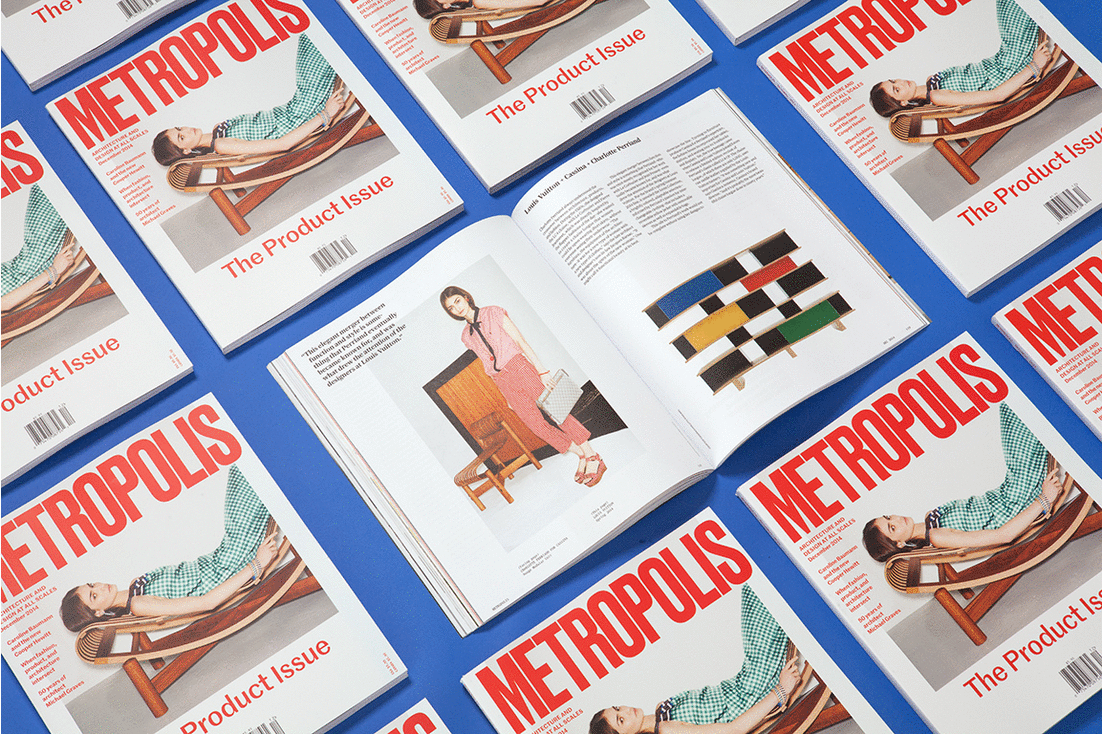
The Metropolis logo, like other iconic designs, needed only minor adjustments. The logo now appears in Druk, a typeface published by Commercial Type, a type foundry based in New York; the familiar skyscraper-like letterforms are now on scale with our page size. As you begin to read, you’ll notice a completely new palette, also from Commercial—Marr, a sans-serif paired with the serif Publico and its mono-spaced companion—chosen to reinforce our distinct voice: humanist, historically aware, tech savvy, and accessible. And if you find yourself stroking the paper, you’ll recognize the pleasure of a smooth, tactile uncoated surface that also provides a comfortable, glare-free reading experience.
To reinforce our editorial mission of analyzing design and architecture “At All Scales,” we start with “Spectrum,” a selection of significant designs, from a tiny circuit board to the metropolis. We continue to modulate your reading experience through detailed examinations of everything from materials to environments, as well as quick takes on trends, like our new fascination with animal forms. “At All Scales” continues, taking an overarching look at all that is happening in design.

“In Depth,” our feature section, signals an intense experience that takes you through interviews with key industry figures and big–picture thinkers showing the way forward, to explorations of global market conditions shaping local design, and the growing intersection between design disciplines (in this case, product design, architecture, and fashion).
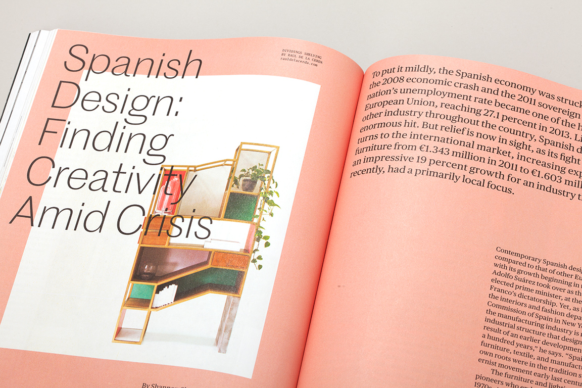
If all that doesn’t capture your imagination, look at the stories lined up behind “Perspectives,” a robust editorial section placed purposefully in the last third of the magazine, usually left to jumps from overlong text. Here, you’ll find critical assessments of shows (the Michael Graves retrospective), interviews (Paul Hawken on how existing resources are poised to reduce our carbon footprint), and a broad selection of new products.
In the magazine, we collect a universe of ideas. It’s up to you to take this, your first look at cutting-edge design, and use it as your guide to explore, touch, feel, and breathe in the physical world.
The reimagined Metropolis celebrates the human element. Our designers and editors came together to create a magazine to stand out from all other media, as a wonderful object and indispensable source of information on the designed environment. Their enthusiasm, commitment, and imagination are visible on every page.


