


March 26, 2010
Q&A: Rodrigo Corral on Book Covers, Design Inspiration, and the Changing Media Landscape
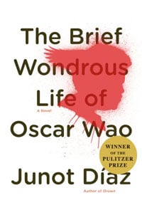
The New York graphic designer Rodrigo Corral has crafted some of the most memorable book covers of the last decade: the sprinkle-dipped hand of James Frey’s A Million Little Pieces; the red-graffiti (or is it blood?) silhouette on Junot Diaz’s The Brief Wondrous Life of Oscar Wao; the gleefully macabre illustrations for all of Chuck […]
The New York graphic designer Rodrigo Corral has crafted some of the most memorable book covers of the last decade: the sprinkle-dipped hand of James Frey’s A Million Little Pieces; the red-graffiti (or is it blood?) silhouette on Junot Diaz’s The Brief Wondrous Life of Oscar Wao; the gleefully macabre illustrations for all of Chuck Palahniuk’s novels since 1999–including his newest, Tell All, to be released in May. Based on that list, you might assume that Corral specializes in depicting American male angst, which is not entirely accurate; his most recent designs include a box set of Akira Kurosawa films and Mary Kate and Ashley Olsen’s Influence (two projects that, one suspects, have very little else in common.) Earlier this year, I caught up with Corral to ask him about his working methods, the changing face of the design profession, and the differences between designing for Chuck Palahniuk and the Olsen twins.
First, some history: how did you get involved with design and eventually end up with a New York design studio?
I’ve always loved to draw, but it’s been my fascination with popular culture that led me into design. I realize pop culture isn’t so exceptional these days—it’s everywhere and it’s hard to be inspired by it—but while I was growing up, I was affected by TV shows, advertising, and the ideas behind them. Mostly, I was interested in the way visual communication could reach and affect people during the seventies and eighties. TV was different then, and even sitcoms were more meaningful than they seem to be today. They did not feel as safe or politically correct.
At the School of Visual Arts, I learned more about the theories and processes of conceptual design, and I was able to learn on the job afterward in book publishing. Forming my own studio was just the next step in being able to expand on the projects I could work on.
Do you find that your personal interests spill into your professional work?
I think it’s relatively safe to say that everything I do and encounter and experience in life affects my work in some way because it strengthens my visual archive. Because so much of what I work on involves the world around us, my work and outside interests are quite similar. I love to play basketball though, and I haven’t done that professionally. Yet.
Are there certain types of projects you find the most attractive?
I love to take on a project designated for an audience that is new to me. Learning about new audiences can be creatively and sociologically fascinating on so many levels.
In approaching a new audience, I start by checking out what that audience reads. When I started designing fashion related material, I picked up tons of magazines—not just Vogue but also art magazines like Purple. I try to ingest as much as I can and then put my own ideas into the actual content I’m designing. I don’t want to copy what’s out there, but it’s important to know as much as you can about what exists.
Your covers for Chuck Palahniuk seem particularly striking in their conceptual ties to the subject. Visually, they draw heavily from multiple elements of the story. Can you discuss how you create those graphic links between cover and content?
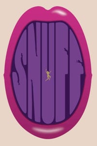
I’m really proud of the work I have done for Chuck’s books, and a large part of that is because his fans seem to get it. It is not something I can explain, other than that I read each new book a couple of times, try to get a sense of the deeper concepts, and then illustrate them. It sounds obvious because I’m just laying out the definition of jacket design, but with Chuck’s books, I can be a little more obscure, because his readers generally respond to it.
In a 2008 article you mentioned that you have only spoken to Palahniuk once in ten years of designing covers for his novels. Is that typical?
I get asked this question a lot, but when I’m designing covers, I really don’t have much, if any, contact with the authors. Messages and comments are transferred through the publisher, and I’ve received very nice letters from authors, but there is never a dialogue with them during a cover design. I designed a book for Mary-Kate and Ashley Olsen and worked with them directly, but that book was about them, so the contribution required was altogether different.
 I wanted to ask you about A Million Little Pieces as well. Did any of the controversy over that book spill over into your work?
When the book became so successful, people noticed the cover—a design that may not have happened if the publisher had expected the book to do so well. It got attention in design circles, which I was proud of. I started receiving significantly more memoir manuscripts and people might have wanted something similarly iconographic in design, but I tried to steer clear of that. None of the controversy ever affected my work, other than it being spoofed a couple of times.
Having designed a lot of book covers, so do you see your role evolving as the industry moves away from print media?
I do, and in what direction only time will tell. That sounds cliché, but clichés are true. I am interested in moving images. I recently did some work for the Criterion Collection that I’m really proud of, including a twenty-five-DVD boxed set of Akira Kurosawa films, and I would like to continue working with film subjects.
 What about idea generation? Do you work from a sketchbook?
I don’t keep a sketchbook, but I still sketch ideas on paper, usually scraps. I keep lots of notebooks and binders of things that inspire me, which I think is so important for the creative process. I think everyone starting out in design should get in the habit of tearing things from newspapers and magazines regularly. Even if you don’t know why you’re keeping something, one day you will use it. And not online images! Buy and keep printed material. Print pieces broaden understanding, sense of experience, and visual reference.
For example, I might find an old print that I can literally edit and use on a book jacket, but for the most part I endorse this process as inspiration. The catalog of images I’ve collected is great, but much of that and more is in my head. So when I hear a story that recalls something I’ve seen, I can be inspired by that image to create something new. If the image is something I own, I’ll bring it out. But this is primarily an inspirational process that can draw from hand-lettering, typographic styles, a color palette, content . . . really anything at all.
Do you feel that this collecting represents your specific design process?
It’s like what I described talking about Chuck: I read the books, look for meanings which help drive the stories but are not necessarily obvious, and I try to come up with an image that will illustrate a few of these ideas at once. The hope is that it will be beautiful or interesting enough for a reader to want to know more, and that they will feel more attached to the image, or maybe a part of it, as they read the book.
Again, I realize this might sound obvious, but the parts of the process that are unique and special really come from the individual designer’s experience. I think about the people who might read this article, and assuming some will be design students or younger people just getting into book design, I have to say that in order to come up with ideas—which, aside from a solid understanding of typography and typographical context is the most important part of all of this—you have to have an understanding of what has come before and what is current. I’ve spent years in used bookstores and magazine shops looking, admiring, and collecting, and this is all a part of the “design process.” The things I have stored in my brain and all that is still out there to see and learn are all part of the process.
.
Previously: We talked to Irma Boom and Chip Kidd about book-cover design. In 2005, Rick Poynor wrote about a resurgence in smart design at Penguin.
All images courtesy the publishers


