


March 29, 2024
The Healthy Transformation of a Los Angeles Warehouse
While L.A.’s San Fernando Valley contains many lovely people centered residential streets, most of its commercial thoroughfares are anything but. Lined by row after row of standoffish horizontal sprawl, they’ve been designed (if you can call it that) with practicality in mind: to be seen from cars, parked in, and populated with little connection to community, humanity, or nature.
Los Angeles architects Patterns, helmed by Georgina Huljich and Marcelo Spina, set out to challenge this condition when they designed a multilevel medical and wellness facility along Victory Boulevard.
The project centers on the adaptive reuse of a 1940s bowstring-truss supermarket warehouse into two floors of space for WelbeHealth, a full-service senior care facility, along with forthcoming upper-floor wellness facilities for yoga, Pilates, physical therapy, and psychotherapy.
Despite increasing the building’s usable square footage significantly, the firm’s most important moves involved taking pieces away, or “liberating” the boxy, sealed-off design, as Spina puts it, and creating a sense of connection and community.
“We managed to do things that are more human,” adds Spina. “We kept the spirit of the original building but made it better with meaningful interventions. Light comes in in surprising directions. You’re surrounded by existing things in new ways.”
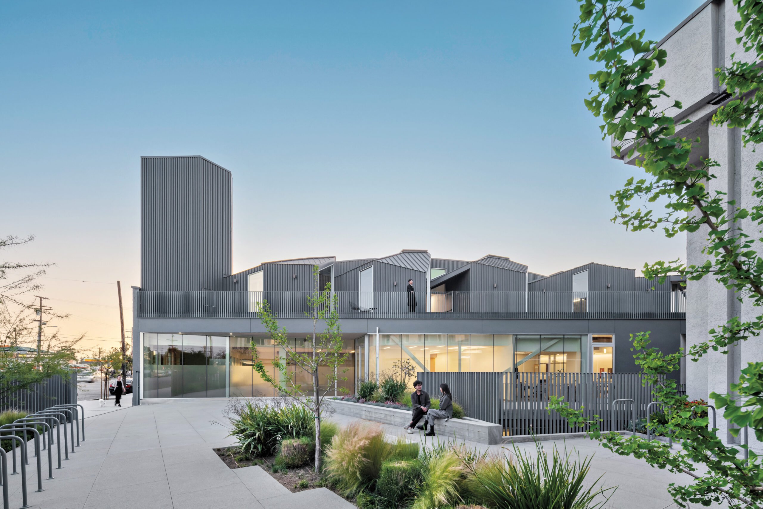
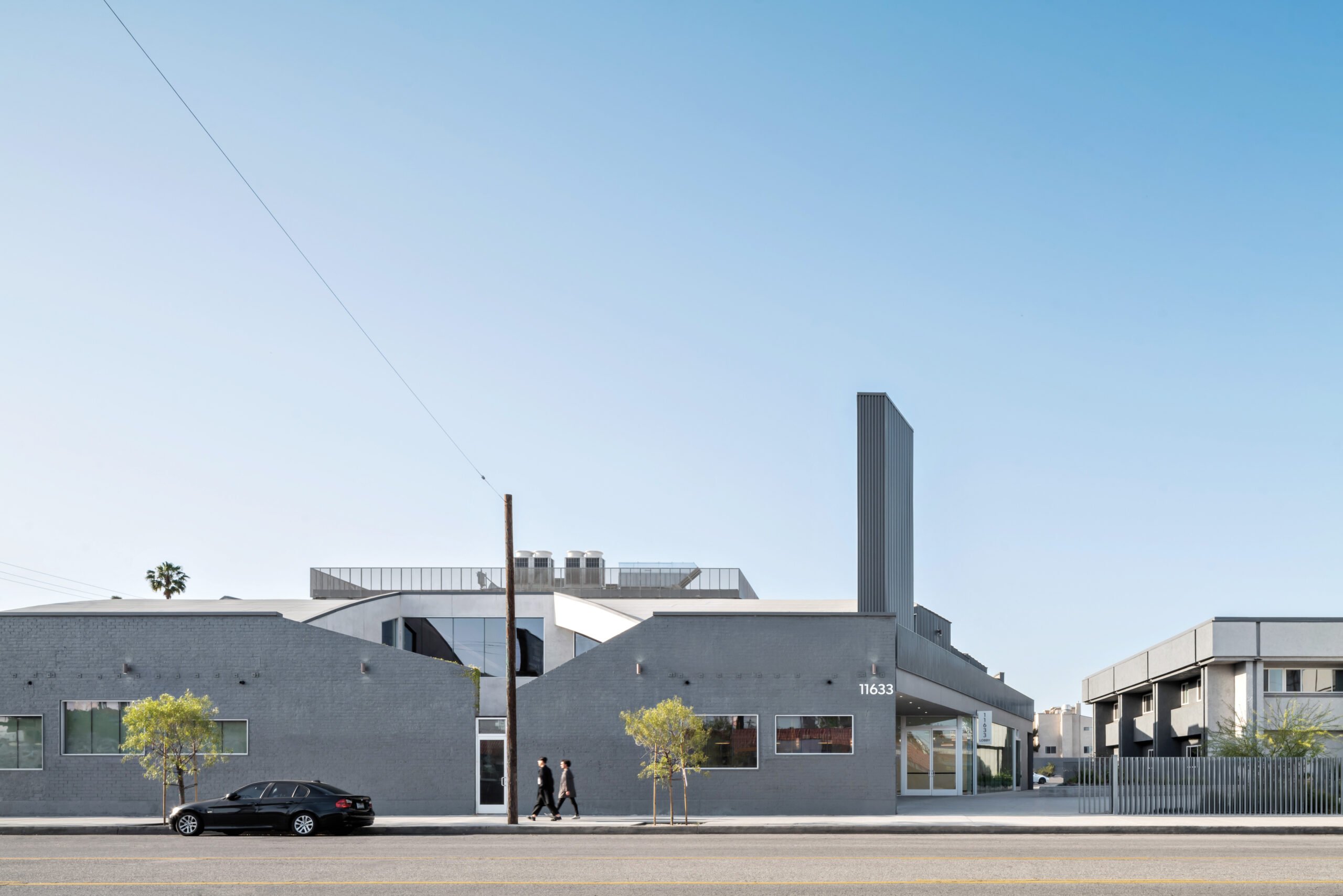
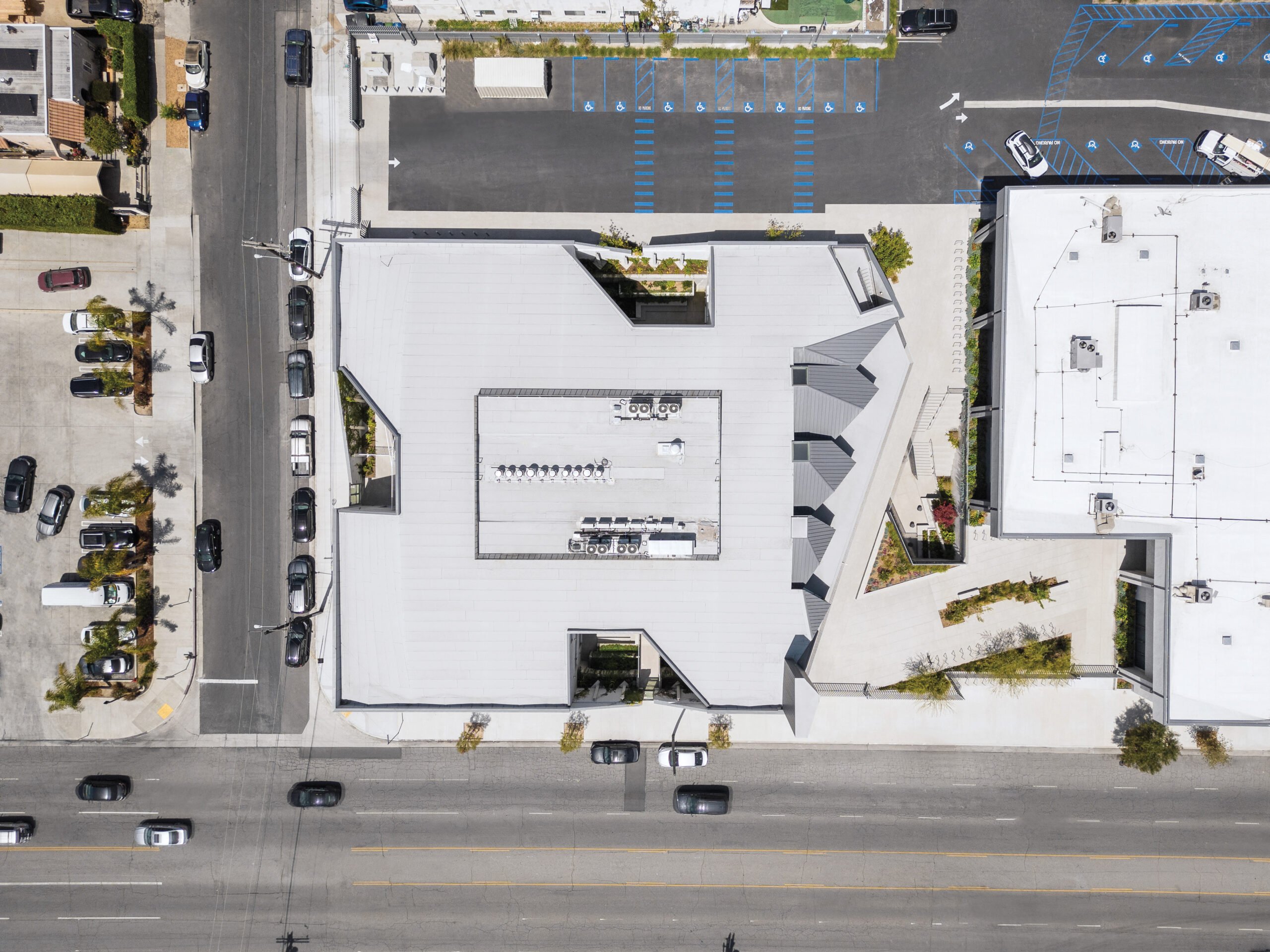
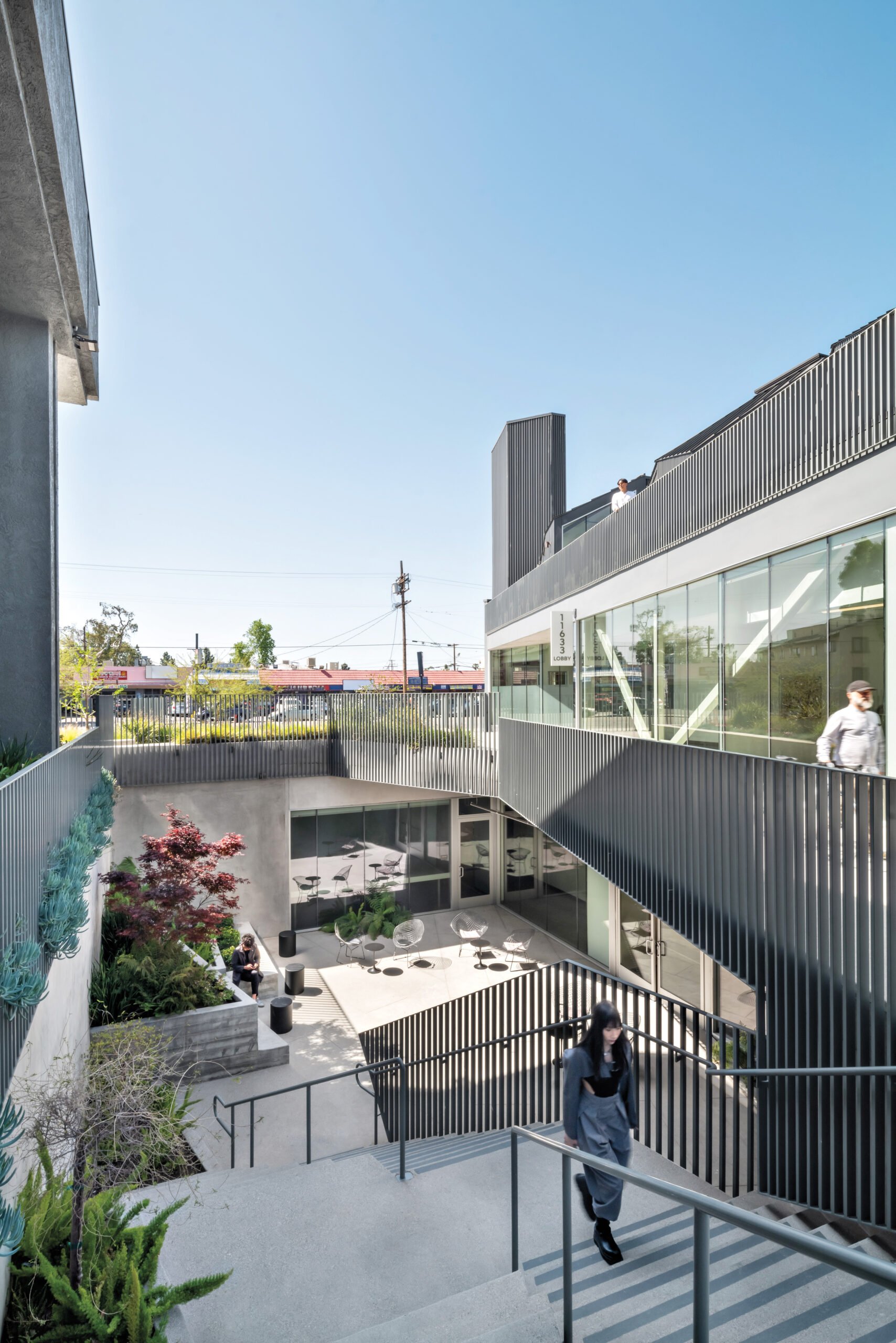
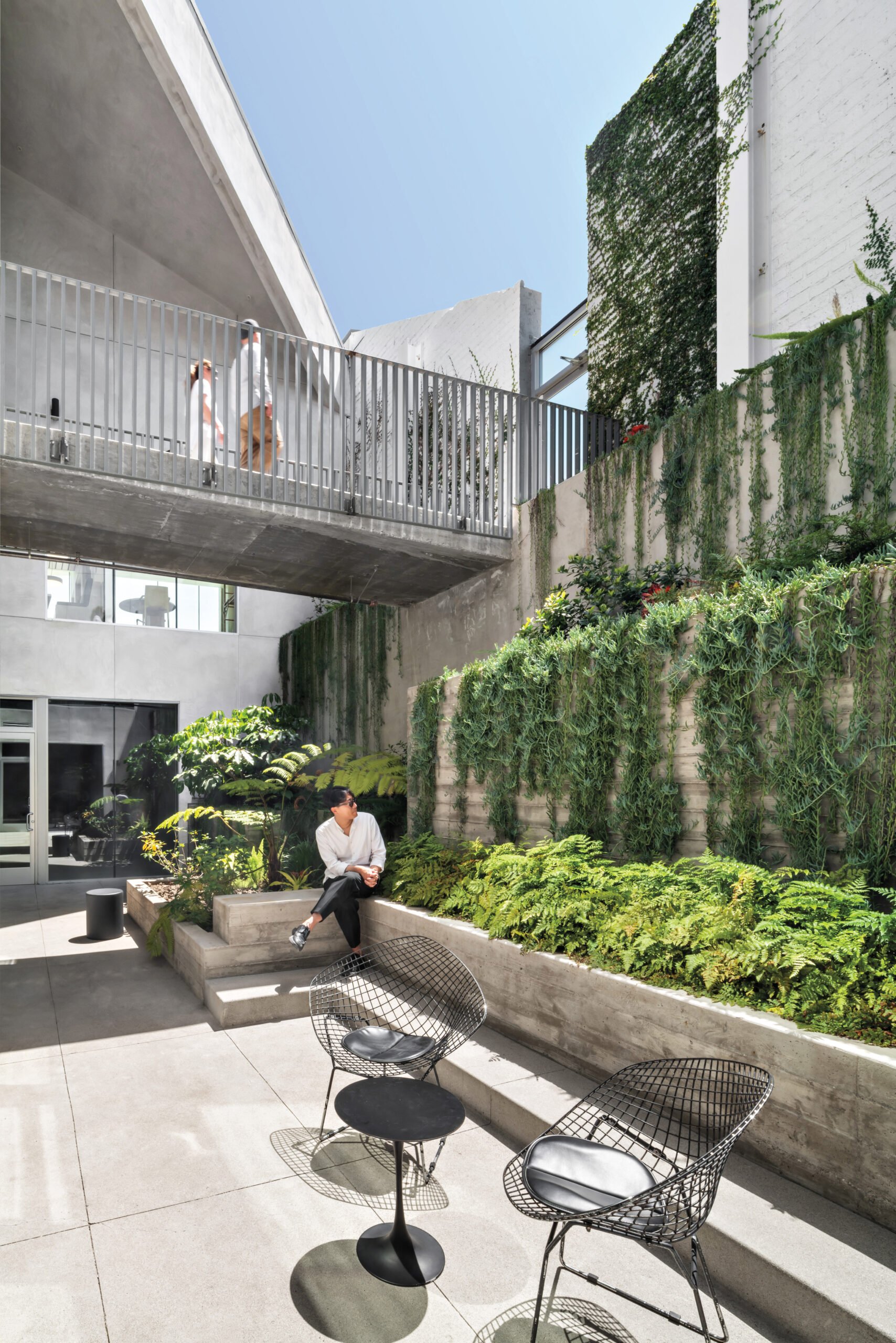
The first interventions you notice are the unification of the campus via a palette of dark gray paint, the retrofit of the old facility’s signage with a more subtle corrugated tower, and an expanded outdoor plaza filled with fixed and movable seating, grassy areas, and steps for seating and events. Beyond that, the firm carved out four vertical courtyards—one on each side of the building, and all but one dug into the ground—pulling natural light into all levels and creating unique public sites lined with furnishings, concrete planters, and layers of lush greenery, all of which can be enjoyed in person or simply via views from the inside.
Inspired by (among other things) the sharp angles of the beams making up the building’s central truss, the firm “played with the mass,” slicing diagonal cuts into exterior brick walls that bring still more light and air into the building while creating a unique sense of visual tension.
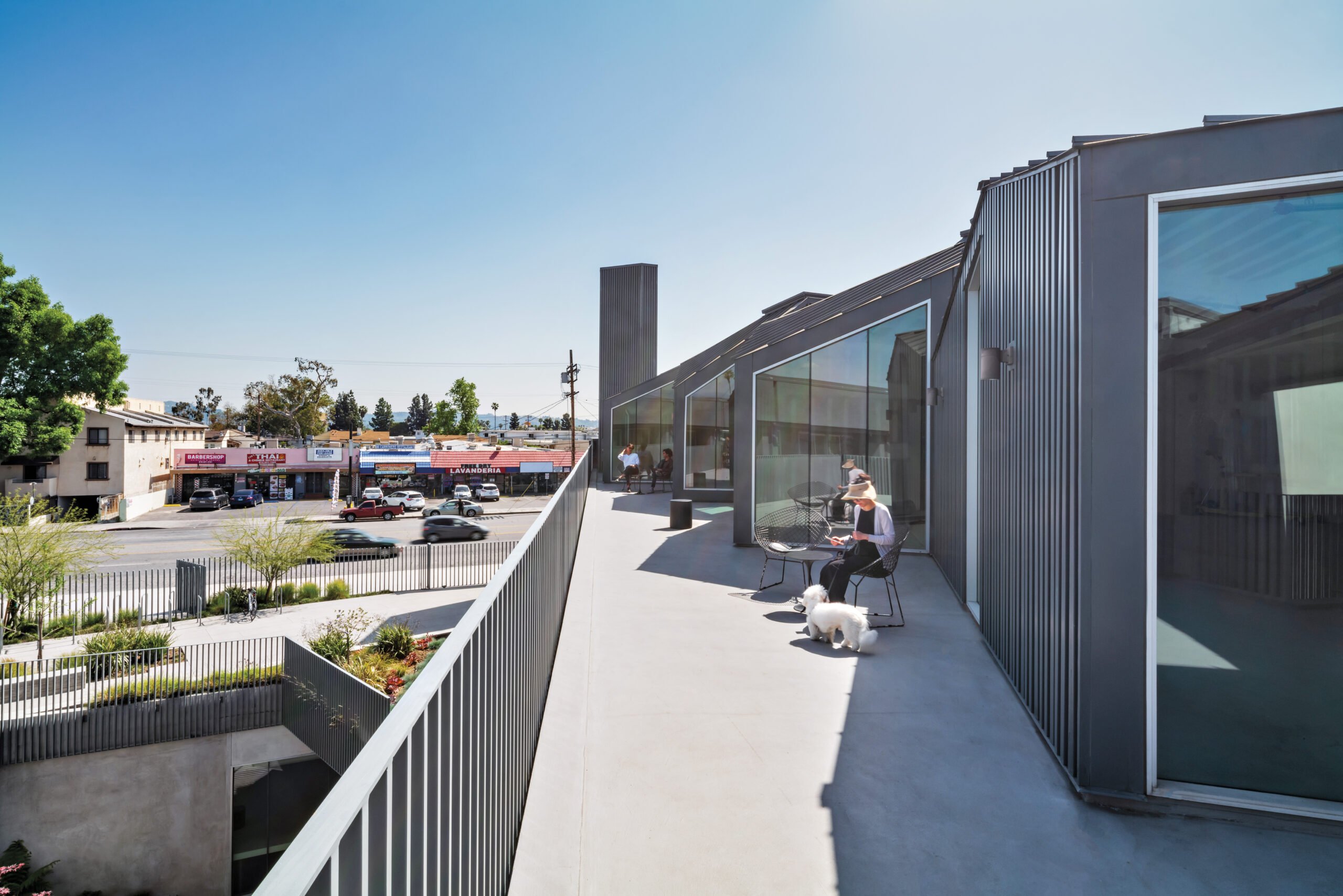
(An uneven rhythm of windows along the edge adds to this sense of off-kilter visual variety.) Above the base of the bowstring truss, the firm installed a level of podlike volumes that break down the complex’s overall scale, creating a village-like feeling that subtly alludes to the Valley’s singlefamily residential tradition. Clad in dark gray corrugated metal walls (matching the standing seam roofs here), this upper zone provides large windows and balconies, enhancing the connection to the street. These spaces hadn’t yet been leased at the time of writing, but a tour through them revealed spacious, light-filled rooms shaped by the original bow truss’s arches and energized by forests of exposed wood and steel columns and beams.
Patterns did not design WelbeHealth’s interiors, but the company, which has facilities around California, has fit nicely into the architects’ core and shell with modern, light-filled interiors that take advantage of the project’s natural light, spacious interiors, and lovely courtyards. One hopes the firm gets a chance to redevelop the client’s adjacent building, a 1970s “Valley Brutalist” structure that thus far has only been repainted. And that local taggers stop using the building as their dramatic new palette.
Indeed, hope springs eternal in the effort to bring the midcentury Valley into the 21st century. “It still feels familiar, but it’s not what you expect,” notes Spina. And that’s exactly the kind of approach that this dated urban/ suburban realm needs.
Would you like to comment on this article? Send your thoughts to: [email protected]
Latest

Products
3 Building Products that Balance Resilience and Responsibility
From windows to roofing, these three products can withstand extreme heat, winds, UV exposure, among other natural threats.
Viewpoints
Behind the Evolution of L.A.’s Mobility Landscape
Renewing the Dream: The Mobility Revolution and the Future of Los Angeles (Rizzoli Electa, 2023)
Profiles
Mae-ling Lokko Designs from the Ground Up
The designer and architectural scientist is rethinking the fabric of the built environment by connecting the dots between agriculture, construction, and social equity.