


November 10, 2009
Logo-rrhea
‘Tis the season for new graphic identities, apparently. Already this month, three institutions–the Art Directors Club, Chrysler, and the New York Public Library— have unveiled updated logos. Here’s a quick look at the changes. . → . Art Directors Club Trollbäck + Company‘s new design spells out the 89-year-old organization’s name inside a bold pink […]
‘Tis the season for new graphic identities, apparently. Already this month, three institutions–the Art Directors Club, Chrysler, and the New York Public Library— have unveiled updated logos. Here’s a quick look at the changes.
.
→ .
Art Directors Club
Trollbäck + Company‘s new design spells out the 89-year-old organization’s name inside a bold pink rectangle–a major departure from Paula Scher’s original logo, which, according to the folks at Unbeige,was based on Albrecht Dürer’s monogram.
.
.↓
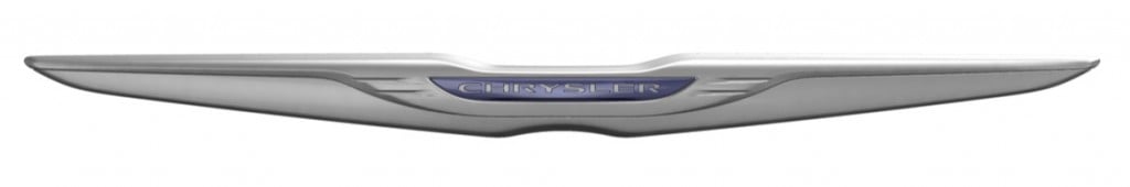
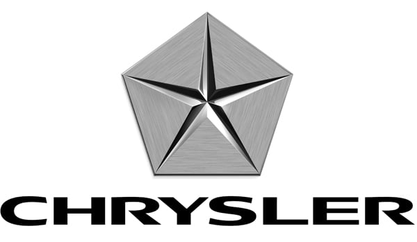
Chrysler
For its new corporate identity, the beleaguered car company dropped the Pentastar in favor of a winged logo similar to the one it used in the 1990s. (For a comprehensive look at Chrysler’s evolving logo, check out this recent Jalopnik post.)
.
 →
→ 
.
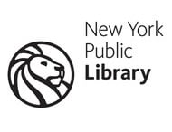
The New York Public Library
Lastly, the NYPL has dramatically simplified its lion logo in an effort to make it more legible in a digital format. (Get a peek at the process in this YouTube video.) The sans-serif typeface is called Kievet.
Have an opinion on the new logos? Leave your thoughts in the comments form below.


