


November 19, 2019
At MoMA’s New Expansion, “There’s No Perfect Circulation Route”
The museum’s revamp includes a transformed lobby, a black-box theater, and thematically-driven galleries.
When Mrs. John D. Rockefeller Jr., Miss Lillie P. Bliss, and Mrs. Cornelius J. Sullivan established the Museum of Modern Art in 1929, Emily Genauer gently shaded it as “the fur-lined museum,” i.e. a place for high society to take in the high art. In 1984, when Cesar Pelli’s behemoth of blue-, gray-, and white-glass embiggened Philip L. Goodwin and Edward Durrell Stone’s 1939 International Style-ish facility, Paul Goldberger wrote that the new MoMA “exudes a contented, self-satisfied air, reminding us how big and settled this museum has become.” And while a few people, Goldberger included, initially appreciated Yoshio Taniguchi’s 2004 expansion, Michael Kimmelman was more hardened, calling it “a people-moving machine, with a Sheetrock atrium, cut off from the street, herding masses upward toward anodyne spaces without repose.” Which is all to say that arguing about MoMA is as old as MoMA itself.
Diller Scofido + Renfro had opinions, of course, way back in 2014 when they were brought on with Gensler to renovate, expand, and correct Taniguchi’s work. “As New Yorkers, we knew it fairly well, the way a visitor would. Well, maybe a little more than that,” says architect Elizabeth Diller, founding partner of DS+R.
The project’s first phase, completed in 2017, was a statement of intent: Let there be light and air. And there was, all across the east end of MoMA. The architects opened the warrens of the second floor into 15,000 square feet of two loft-y exhibition spaces. They carved out a new to overlook Philip Johnson’s masterful sculpture garden, and extended the grand Bauhaus staircase to the ground floor, with new steps in graphic Grand Antique French marble.
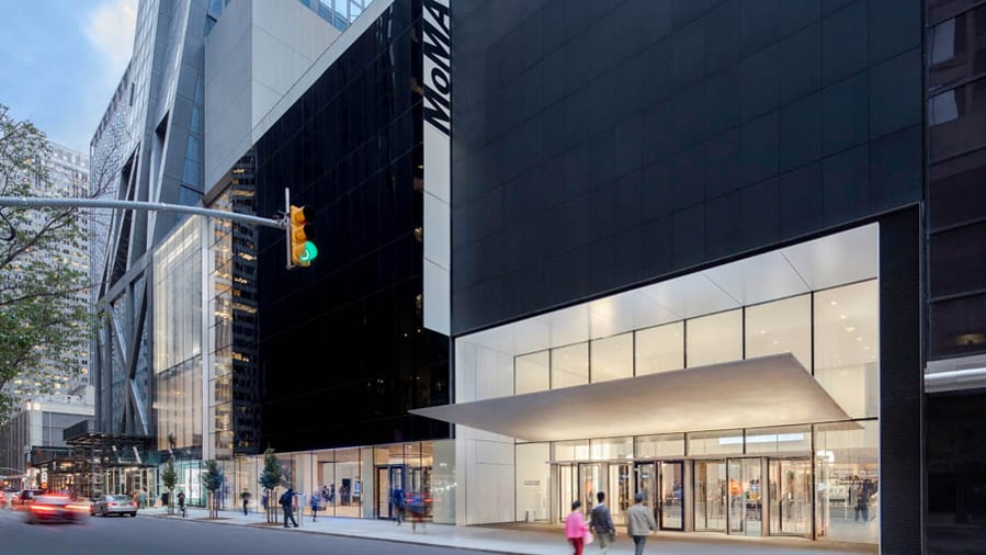
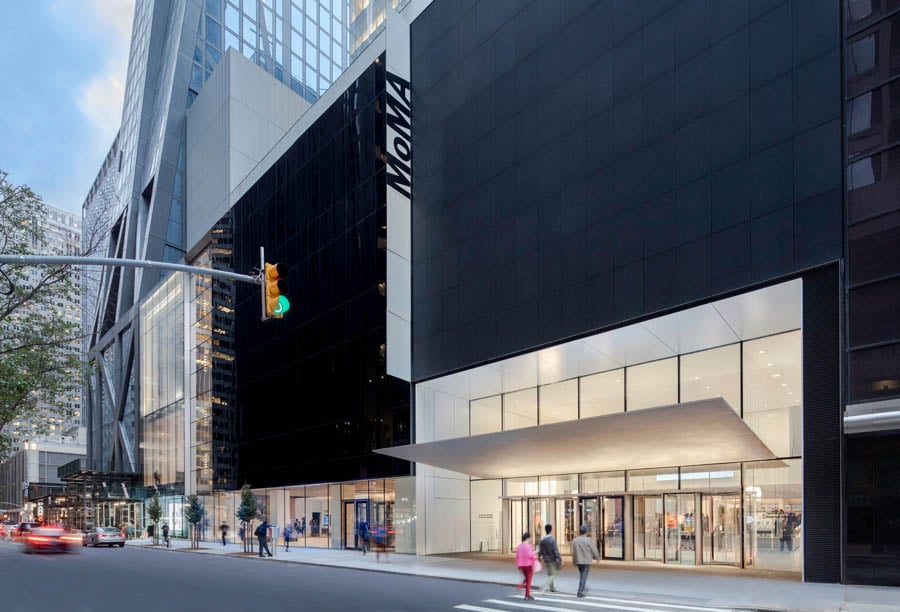
If the first phase was a statement, its newly-opened successor is a manifesto, boldly jettisoning much of Taniguchi’s efforts (and, sadly, the entirety of Tod Williams Billie Tsien Architect’s American Folk Art Museum) in the hope of alleviating some of the crowds that made the former lobby and galleries as crushed as a rush-hour 6 train. Crucially, the first thing visitors see is art. As they pass under the massive, bead-blasted stainless-steel canopy balanced within a suspended glass wall, they encounter a gallery where the ticket queues once gridlocked, then pass through an entry sequence that draws them latitudinally across the campus. The flow of traffic, in other words, mirrors that of the sidewalk, proceeding from the front door to a new lobby and moving in the direction of a new stack of galleries to the west, inserted into the base of Jean Nouvel’s neighboring 53W53 Tower.
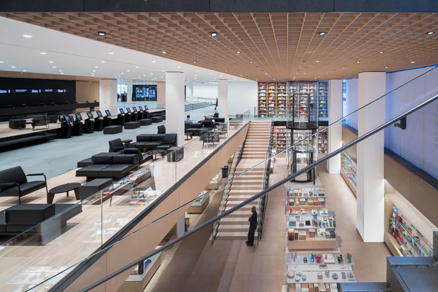
“It was clear the transformation of the lobby had to happen,” Diller says. Raising the ceiling was an easy way to make it less foreboding, as was a second entrance to the East with a larger and faster coat check and dedicated film desk. A bigger ask was relocating the flagship museum store. Potentially disrupting this revenue source was a huge ask, Diller concedes. “It had some negatives, but if we bit the bullet and put the store on a -1 level, it could be double-height and have a dramatic space that wouldn’t interrupt the flow of movement to the west.” A charming elevator shaped like a pneumatic tube, and custom DS+R–designed fixtures, including a two-story tower for books, along with a surprisingly elegant walnut veneer coffered ceiling, helped cushion the blow.
Problem solved, DS+R was free to push back the ticketing into a kind of holding pen, with custom blackened-steel counters and freestanding machines. They clad the space in American Black Walnut wood veneer panels, floored it in Green Vermont slate to match Taniguchi’s, and added walnut acoustical flush veneer panels across the ceiling to help dampen the roar. Frameless glass panels now serve both as structural beams and frames for views of 53rd street. And rising above it all is the “blade stair”, connecting the store all the way to the fifth floor. With its cantilevering seven-foot-wide risers, each held with pins and supported merely by a six-inch-thin vertical spire, it’s the most forward-thinking addition in DS+R’s plan, gracefully integrating futuristic engineering with past aesthetic ideals. “Some of Modernism’s aspirations might seem naïve today,” Diller says, “but pushing materials to the limits seems as relevant now as it did then. Doing unusual things in the spirit of lightness and thinness and transparency is a Modernist touch.”
Blackened-steel portals—themselves “tapered to a knife’s edge,” Diller says, “while Taniguchi’s were framed”—beckon from the stair landings into the new David Geffen Wing inside Nouvel’s building, with galleries that conceal, and sometimes pointedly reveal, the exposed beams of Nouvel’s diagrid. On the second, fourth, and fifth floor, the Jerry Speyer and Kathleen Farley Building is chockablock with various sizes of galleries floored in end grain wood block White Oak and reinforced to withstand an entire room of multi-ton Serra boxes. “There’s no perfect circulation route,” Diller says, “but it couldn’t be like it used to be, where everybody came into the first northern entrance and then worked their way around in kind of a conga line.”

Now, dance pieces can be viewed in the Marie-Josée and Henry Kravis Studio on the south side of the fourth and fifth floors. The black box theater is built for flexibility, with solar shading and blackout curtains to conceal the street views, demountable risers with a capacity of 105, and an acoustic rating that rivals major concert halls. Post-show nightcaps, or mid-show sustenance, can be found on the new café on the sixth floor, which includes both a 55-person terrace and art installations.
New curatorial initiatives include a return to the idea of MoMA’s original director, Alfred H. Barr Jr., that galleries should be rotated and refreshed often; now, much of what’s on display will change every six months. Chronological curation has been deemphasized and supplanted by a thematic impulse. One room, for example, is called “Machines, Mannequins, and Monsters.” Another plunks a chunk of the façade from the United Nations Secretariat Building, designed in 1952 by a UN Headquarters Board of Design including Wallace K. Harrison, Max Abramovitz, Oscar Niemeyer, and Le Corbusier, before a projection of Jacques Tati’s Playtime, so you can watch it through a window. It’s a thrill, as is a room currently devoted to the art critic and poet Frank O’Hara. But much more will be divisive, including displays that pile works on exceeding low rails, out of sight for all but the tallest and most able, and the decision to corner Monet’s Water Lilies into a nook that has already disappeared behind thousands of selfie takers.
There’s much to argue over. And indeed, protestors are taking advantage of the new space’s improved circulation and sightlines and acoustics: They disrupted a pre-opening party to demand MoMA cut ties with trustee Larry Fink, who owns an investment management company that profits from private prisons, and threw a wrench in opening day calls for the resignation of MoMA trustee Steven Tananbaum, whose hedge fund makes huge profits off the government debt of Puerto Rico. They’re starting discussions about the labor issues around the ramped-up gallery programming. They remind us that who funds these expansions—and who keeps them running—matter as much as who designs them and whether they succeed.
You may also enjoy “Pacific Rim Calling: Seattle’s Asian Art Museum Gets a Revamp.”
Would you like to comment on this article? Send your thoughts to: [email protected]


