April 11, 2016
The Dutch Designer Behind Vitra’s Color Revolution
As art director of Vitra’s colors and materials, Hella Jongerius has spent a decade mastering shade and tone.

The designer Hella Jongerius has worked with Swiss manufacturer Vitra for ten years and currently serves as the company’s art director of colors and materials.
Courtesy © Vitra, photography Studio Likeness
There’s something refreshing about a design practice that doesn’t engage with the all-consuming, black-hole hype machine that has swallowed up the design industry. The only black hole in Hella Jongerius’s design studio in Berlin is a faceted, spiky doughnut made of triangular planes and painted an industrial noir so deep it pulls light into it. There’s no hype, no starlight so bright as to blind. That there easily could be, given Jongerius’s standing among today’s most influential designers, makes its absence all the more sweet.
Jongerius is a measured collaborator—a builder of relationships with mutual benefit, as is best illustrated by her long-standing relationship with Vitra. In 2006 she began working with the Swiss furniture company, and she is now its art director of colors and surfaces; in that role Jongerius has been largely responsible for overhauling Vitra’s entire color catalogue. The partnership, much like her own alluring designs, has unfolded over the course of years, not seasons. “It’s true love—maybe it’s too easy to say it like that—but like for Vitra, what I did the last ten years for colors, that’s something you grow into.”
This evolution has resulted in updated colors for Panton chairs and other classics, but it has also yielded a broader process of thinking. The new book I Don’t Have a Favourite Colour (Gestalten, 2016) renders readable this process, depicting a decade of Jongerius’s research into shade and tone. In that time, she has succeeded in building a companywide color and material library. Developed with her collaborator Till Weber, the library is organized according to a taxonomy of personal color predilections with palettes that correspond to the brand’s legion of designers, such as Rietveld, Peach, and the Eameses. Color wheels bearing these names and more are defined by swatches of light and dark, red and green, following an entirely different classification of primaries than those more familiar spectrums ROYGBIV and CMYK. “Today, there is no place for seclusion or questioning in the objective, all-encompassing RAL, Pantone, or NCS color systems,” Jongerius writes of the industry’s rigid pigment standards. And yet this space is necessary, particularly since color is fundamentally a “visual expertise, not a scientific one.”

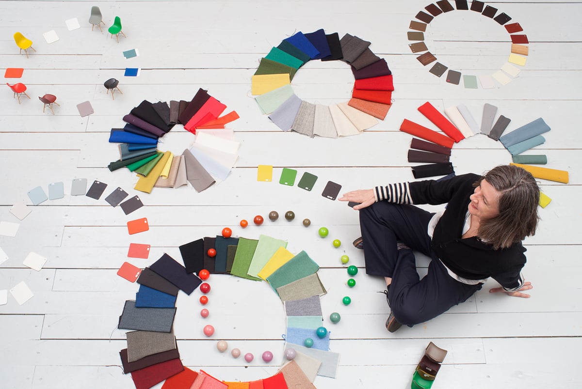
Studies of objective and subjective color systems at Jongeriuslab
Jongerius’s extensive color and textile research has yielded a process of thinking (depicted above in the form of color wheels) that is documented in the new book I Don’t Have a Favourite Colour (Gestalten, 2016), which will be released this month at the Salone del Mobile.
Courtesy © Vitra, photography Labadie/Van Tour
Jongerius’s own work is strongly focused not just on color but also texture, as the book demonstrates. Textile, she writes, helps bring color out of “abstract illusion” and into “materialized reality,” a phase change that reflects the demands of commercial production. “We have the reality of testing and of the industrial process,” she says, and that distinctive pragmatism complements her penchant for research and her striving for “balance between richness, sophistication, elegance—textures!” This is the red thread—roter Faden in German—that runs through everything she does, especially at Jongeriuslab.
The studio, on a quiet residential street in now-chic East Berlin, is an elegantly obsessive space filled with tactile invitations to reach out and touch a slick surface of glaze or an intricate woolly textile. “I wanted to see myself in another daylight,” the designer says of her move to the German capital seven years ago, and of the famous blue hour of Berlin around twilight that paints the white-gray city pale cerulean. But Jongerius’s “another daylight” is also an existential shift, a move to the low-pressure village mentality that the city is known for. “I come from this Dutch design culture, which is huge, and it’s everywhere, so to come here, it’s nice and quiet.”
For Jongerius, color is fundamentally a “visual expertise, not a scientific one.”
Berlin gives Jongerius the relaxed space in which to forge her research and practice, to move her ideas forward in the real world through production. Capitalism has the power to make all things available, if not universally attainable. Even an entry-level Eames chair is an aspirational good for most people, and yet Jongerius finds the silver lining. “The ideas [these objects represent] will eventually percolate down years from now—or maybe two with IKEA,” she says. The yearning and knowledge embedded in high-end design objects, from color to ways of living, influence all of design, from the top down. Admittedly, this is not a perfect system, no Bauhaus dream of democratic design as a self-fulfilling prophecy for an equitable good life, but there is the power to influence people’s lives by “working from the inside.” Jongerius is an expert at this, and her products, for Vitra and other manufacturers, are the better for it. The (false) anxieties about selling out too often preclude this pragmatic—yet romantic—collaborative spirit. “It’s great that you can be a researcher and experiment, and do that with a company while also delivering results for them.” These are not merely transactional relationships, and they work only “if you share values—aesthetic, moral values.”
In 2015, Jongerius, together with theorist Louise Schouwenberg, issued the manifesto “Beyond the New” about the importance of such values. Though it reads like a clarion call, it is nonetheless a measured and serious rebuttal to design’s infatuation with newness and the industry’s dependence on built-in obsolesence. “It was a way to come to deeper meanings about design. Just an object is not interesting—I think it is important to push the envelope, not just create stuff,” Jongerius says. Ever active internationally, she will present a second manifesto this summer at the Serpentine Gallery in London, part of a performative installation that twines elements of praxis and play and that will feature shadow plays projected onto textiles. It will be an intelligent counterpoint to this summer’s multiple-pavilion extravaganza, by the likes of BIG and lesser-knowns, to be erected adjacent to the installation. Design and architecture typically stake out opposite camps.
“We are what we are with the things that surround us,” Jongerius says. “Of course, you can say I work for top-level markets, but all the things we’re doing—this knowledge will trickle down to us all.” Jongerius’s book will be launched at the Salone del Mobile in Milan, one of the biggest international furniture fairs on an increasingly wearying calendar of empty spectacle. Salone is somewhat above the fray, as an original and serious fair. In a space away from the main exhibition halls, Vitra will mount an installation based on Jongerius’s color and textile research; it will be a fun palace celebrating her work but also closing a decade of collaboration in order to begin anew. As Jongerius says, “I have a feeling I’m just starting.”
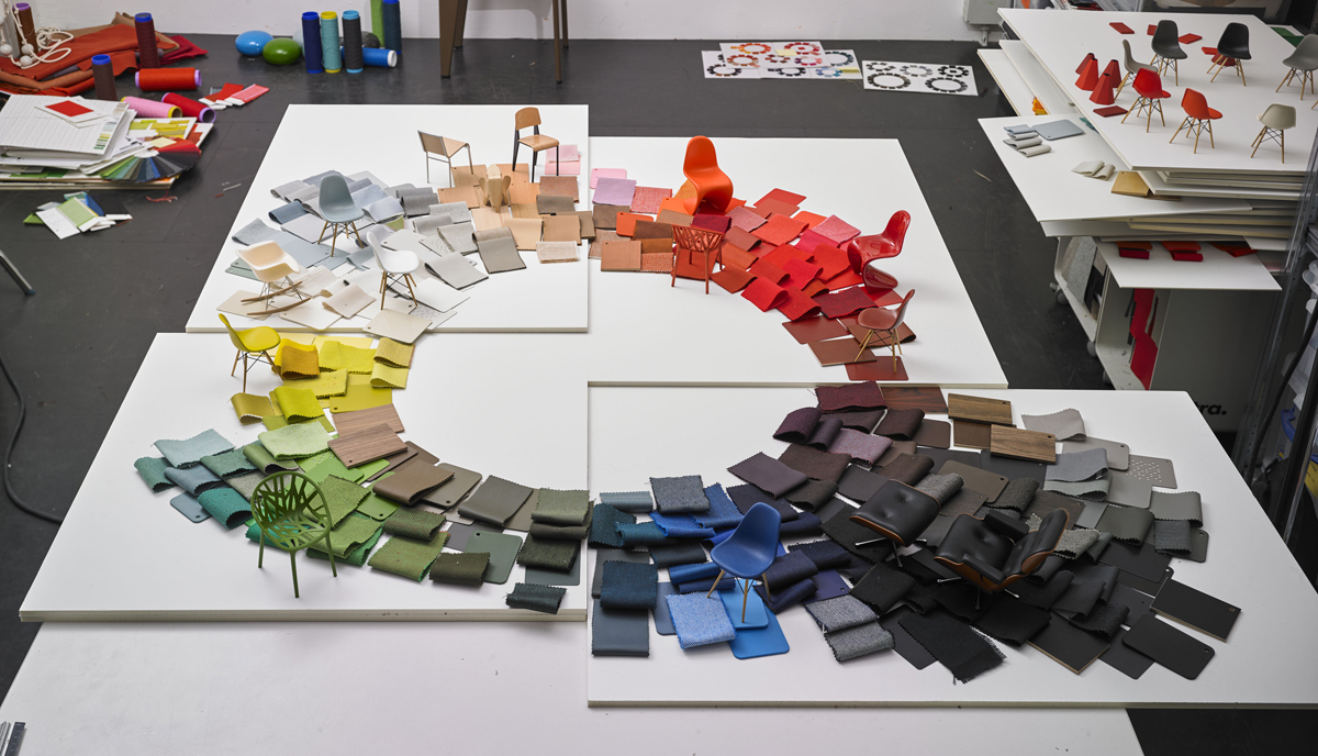
The beauty of the color wheel is the way it can instantly convey a broader vision, as shown here: Fragments of wheels based on several Vitra design classics (the Eames bucket and Lounge chairs, the Panton chair, the Bouroullec brothers’ Vegetal chair) are brought together to create a spectrum of color that encompasses pigments, textiles, and products in one cohesive system.
Courtesy © Vitra, photography Labadie/Van Tour
Jongerius Color Wheel
The innovation of her method is the use of the color wheel, which Jongerius writes was “one of the first steps in the process of getting a grip on the color library.”
Courtesy © Vitra, photography Labadie/Van tour