


July 3, 2008
Bewildering Logos Dept.
Decoding graphic design.
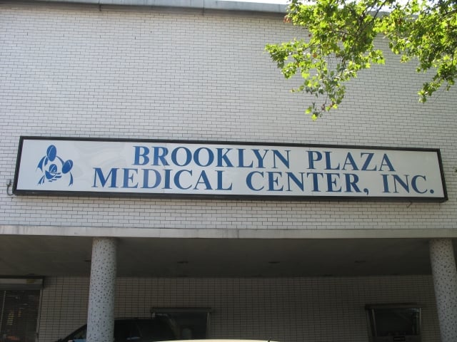
While running errands in the Fort Greene neighborhood of Brooklyn, near my apartment, I often pause to contemplate Brooklyn Plaza Medical Center’s baffling logo. What the heck is it? My best guess is a smiling fish head. See the bulging eyes? The fins? The cartoonish smile? Others I have shown it to have seen a Koala and a crab. No one could begin to speculate as to why this was an appropriate logo for a medical center.
Yesterday the mystery was finally solved.
Snapping photos of the building and its signs attracted the attention of a security guard. Why, he asked suspiciously, was I photographing the medical center? Trying to seem as non-threatening as possible (not a difficult task), I explained my interest in the center’s strange logo. Did he know what it was supposed to be?
Dear readers, he did. Try, if you can, to picture two heads—a mother’s and a father’s—with arms intertwined, swaddling an infant in their embrace. See it? What I had mistaken for an eerie grin is, in fact, the child’s blanket. The fish eyes are loving parents.
So that’s that. I have to admit: I’m disappointed. I enjoyed my fish-head theory. I guess some mysteries are better left unsolved.


